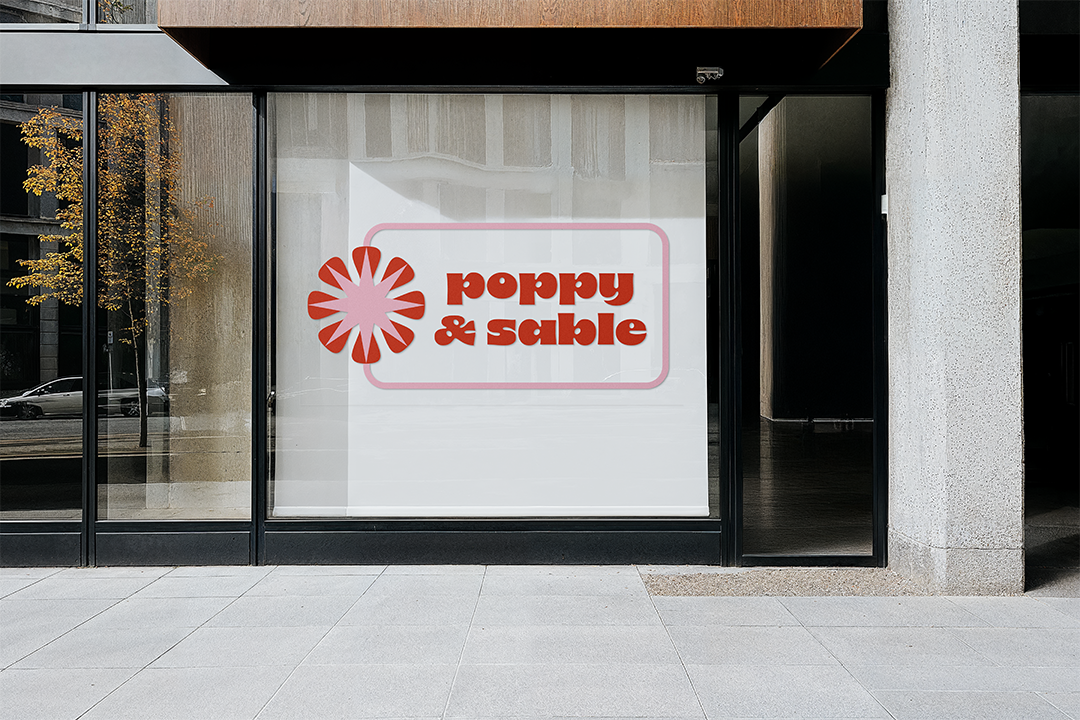
Poppy & Sable is a boutique salon focused on providing their clients with the best salon experience in the business. The salon is known for their skill in dyeing hair, especially vivids.
Project type: Brand
The salon is owned by two stylists, Poppy Hair by Heidi and Sable Hair by Gab. Together, they form Poppy & Sable.
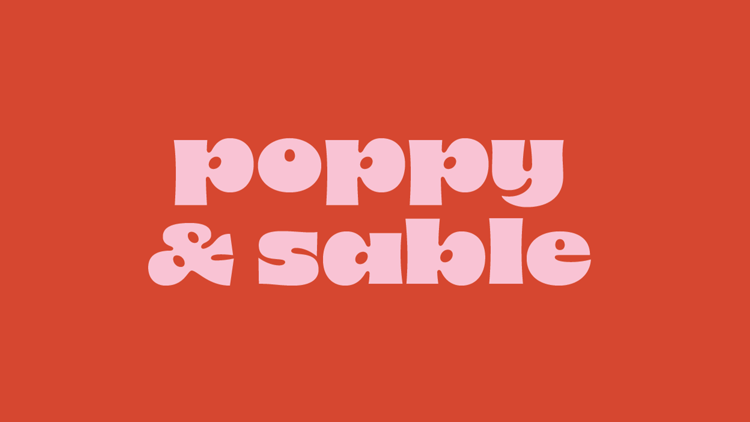
The clients wanted to create a brand that represented their unique and funky styles. We chose a high contrast font to create cohesion across the brand system. The font is highly stylized and is intended to be used at large scale, while Futura, a more pared-back font, is used for smaller text.
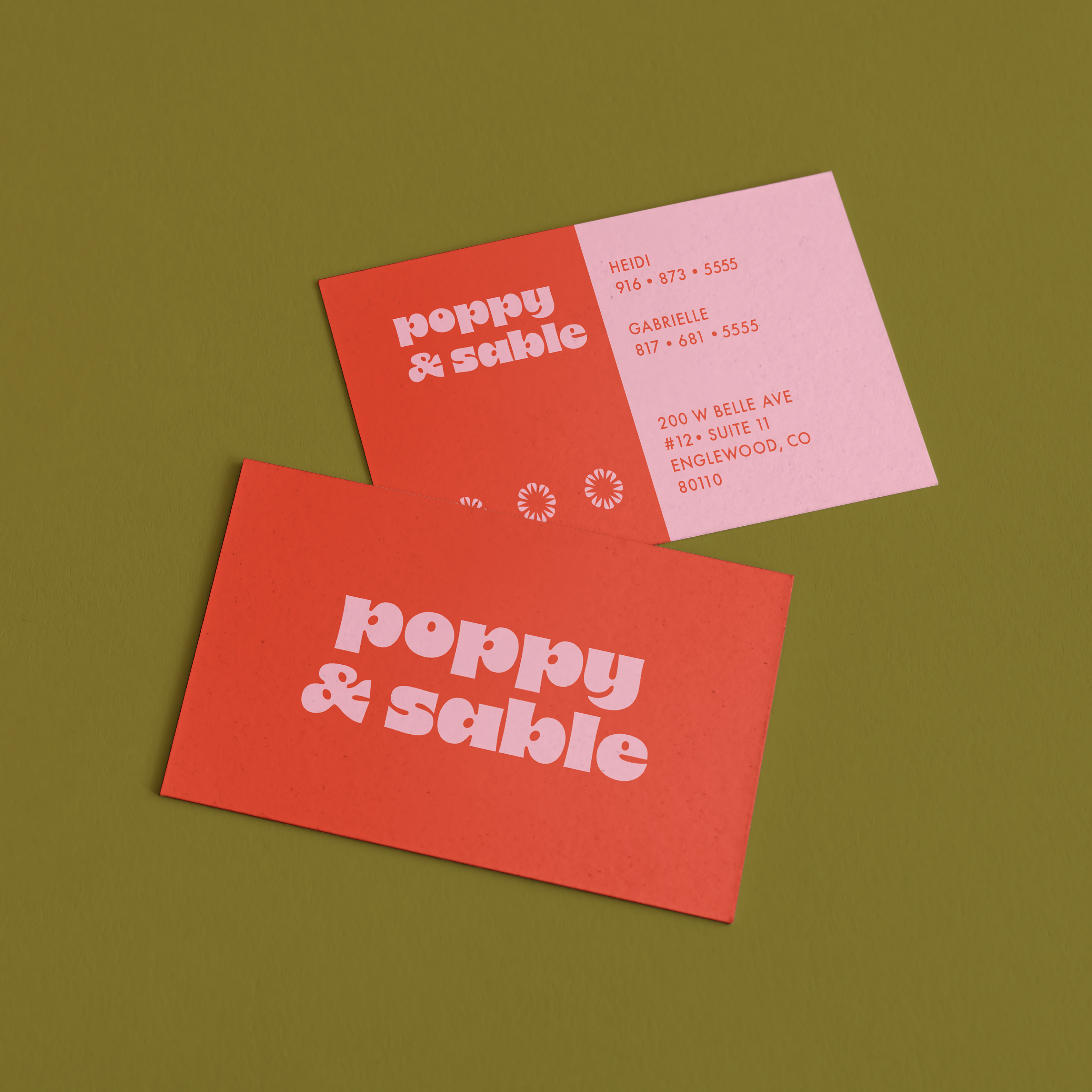

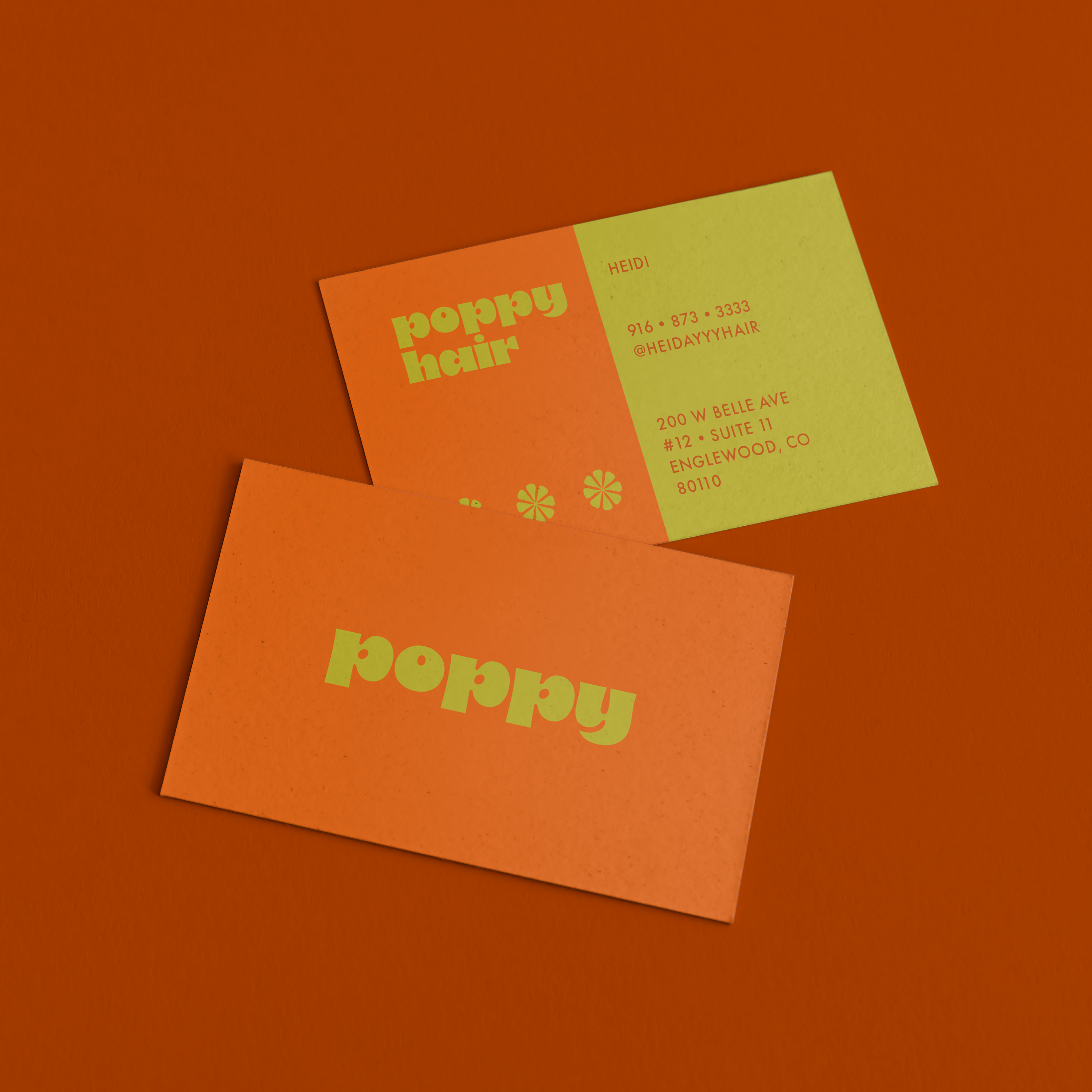

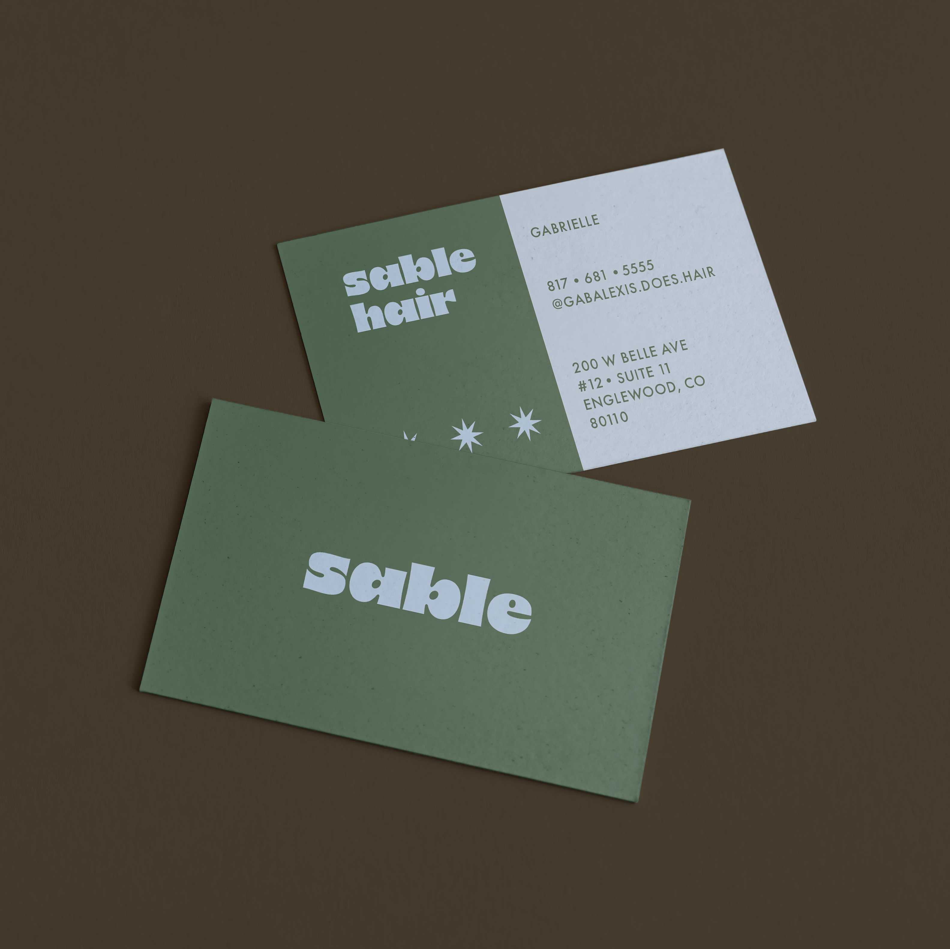
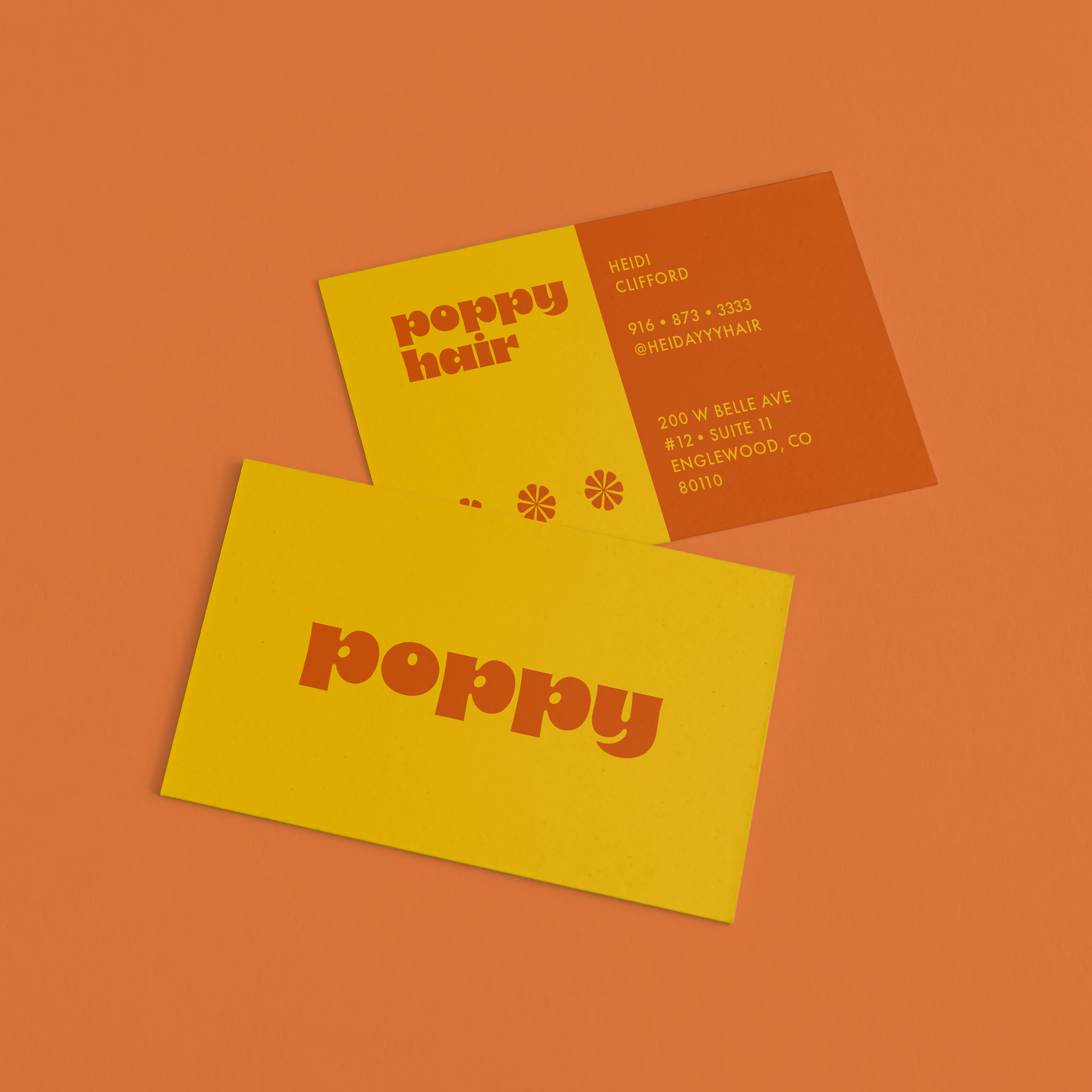
The clients wanted multiple sets of business cards using a cohesive color palette. This gave them flexibility to hand out the correct business card for the situation while playing within a recognizable brand. The palette we chose was nostalgic and slightly groovy, but paired in modern combinations.
The stylists picked a unique motif to adorn their business cards. Gabrielle picked a retro star and Heidi picked a groovy asterisk. On the shared business cards and shared signage, the motifs converge to form a flower motif. This motif serves as a symbol for Gabrielle and Heidi’s partnership. They’re both established stylists in their own right, but they come together to form something that is greater than the sum of its’ parts.