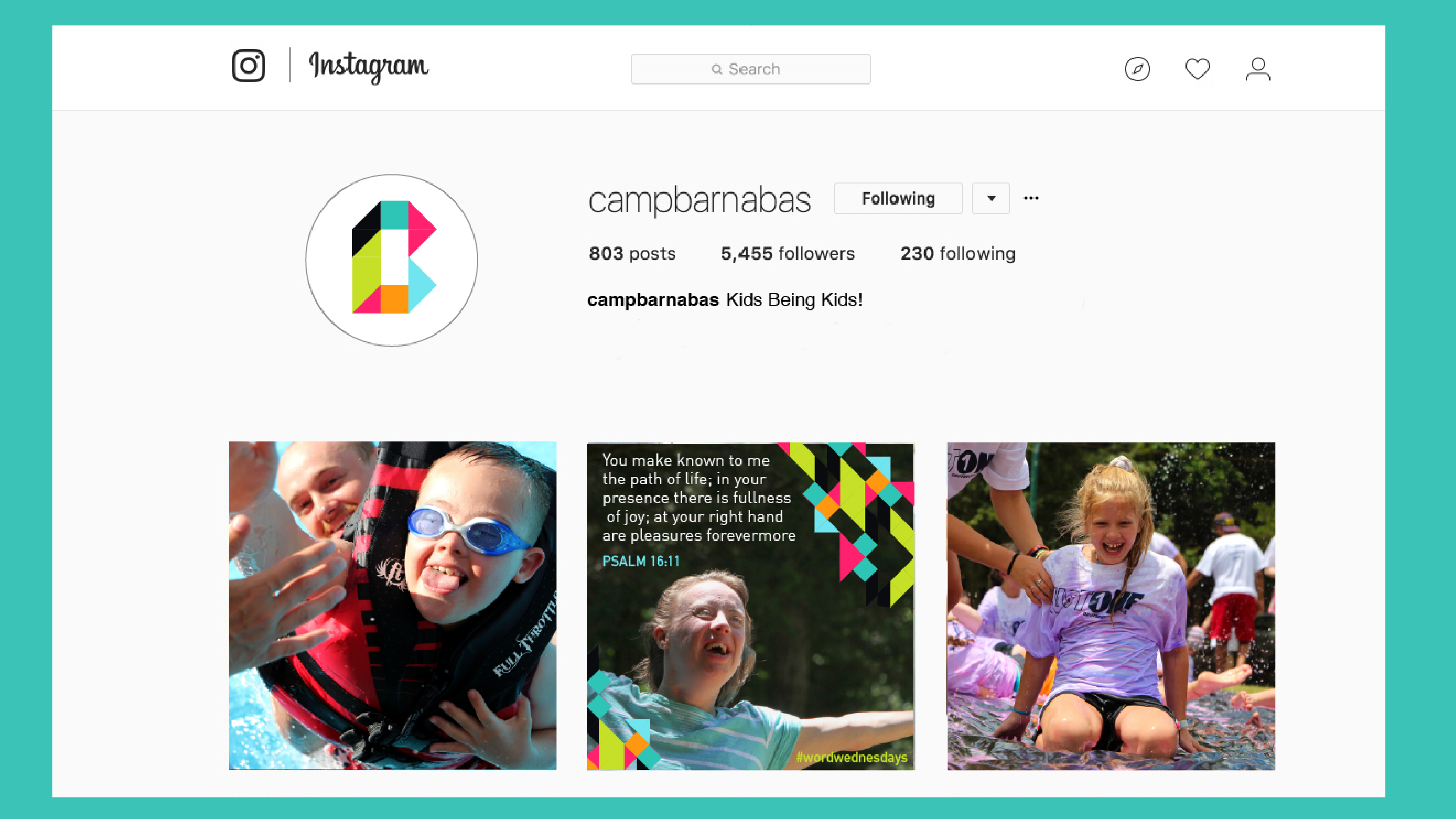
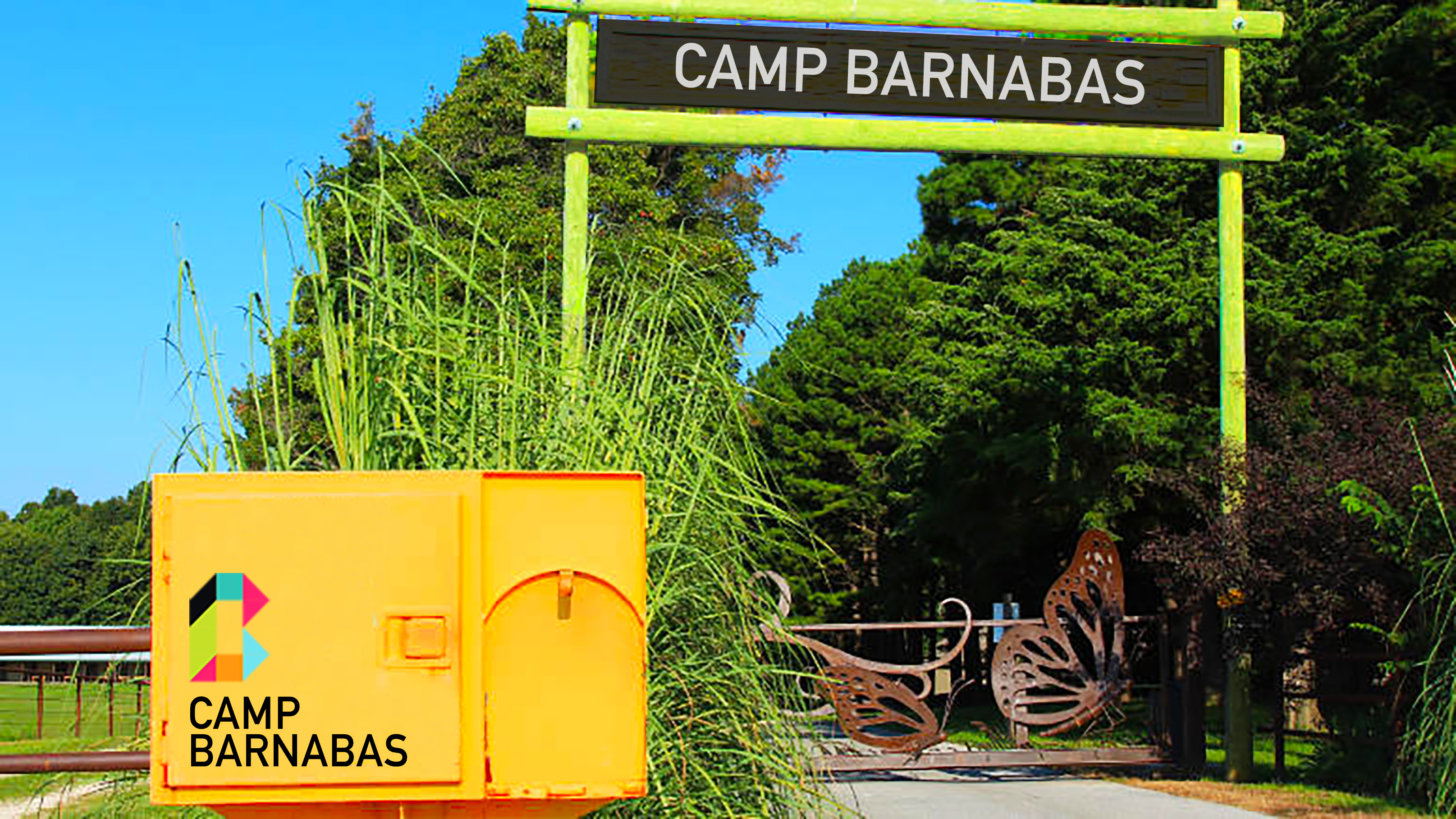
Camp Barnabas is a non-profit summer camp for people with Special Needs in Purdy, Missouri. The current brand system was dated and the drab colors didn’t communicate the fun nature of the organization. The logo, colors, and type system were updated to bring more structure and vibrancy to the brand
Project Type: Speculative Brand
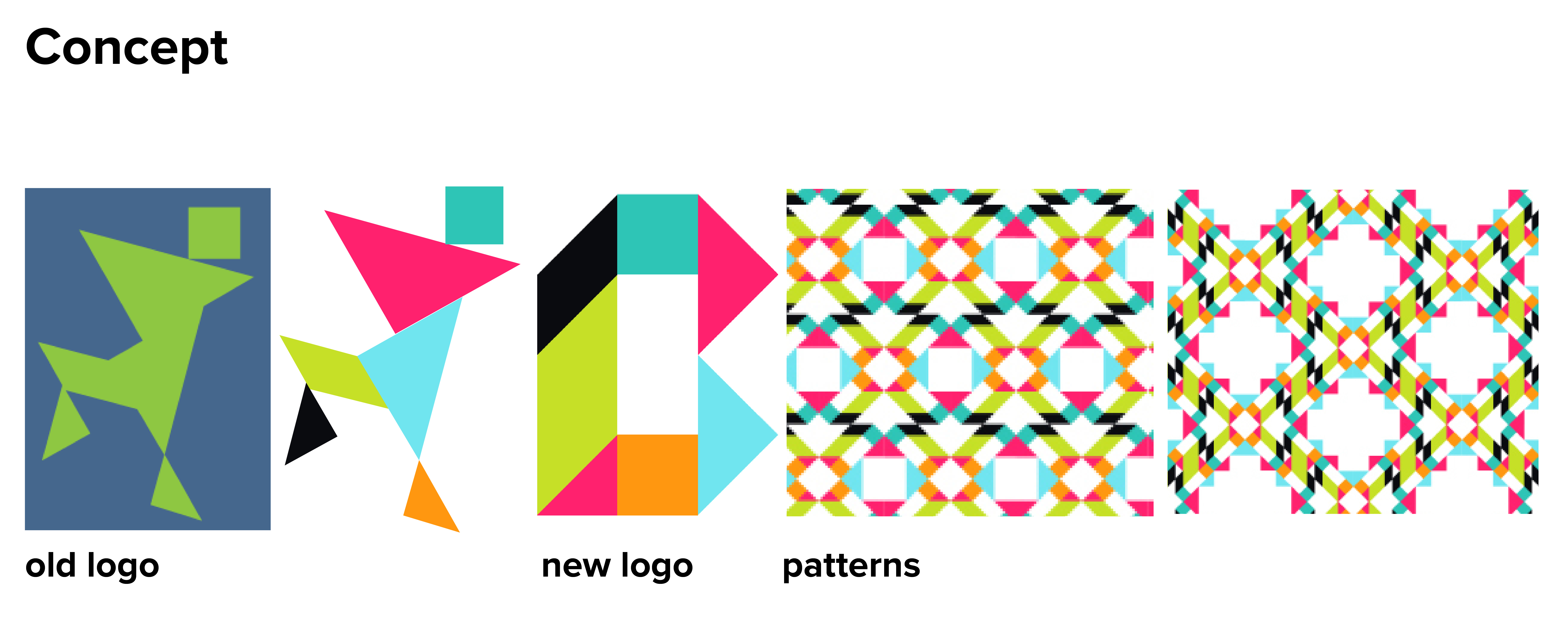
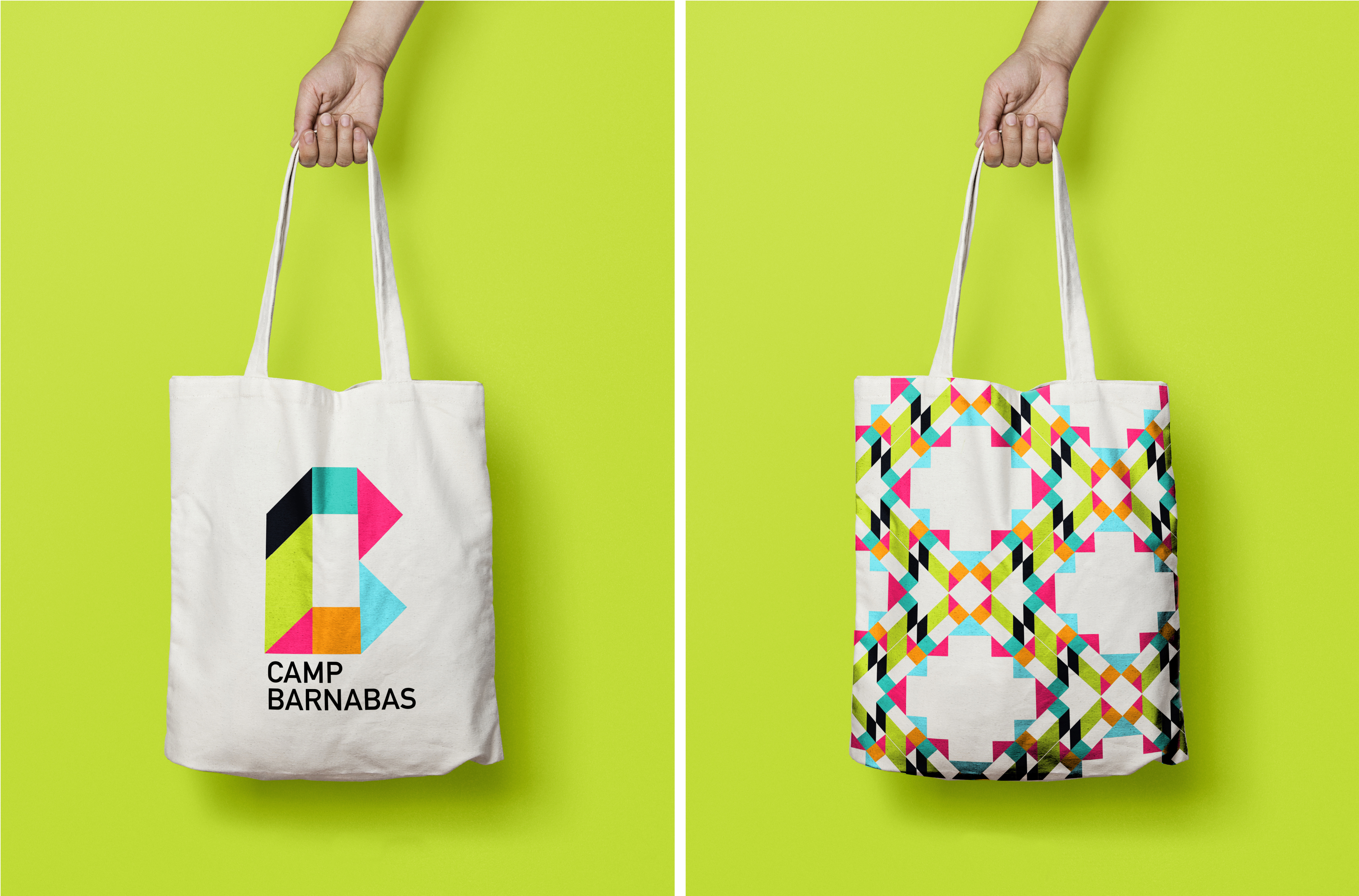
The new logo takes direct inspiration from shapes found in the camp’s old logo. With a bright color refresh and a distinct shape, the new logo has versatility that can be converted into patterns. The base shapes can be rearranged to create endless possibilities while always connecting the viewer back to the Camp Barnabas brand.
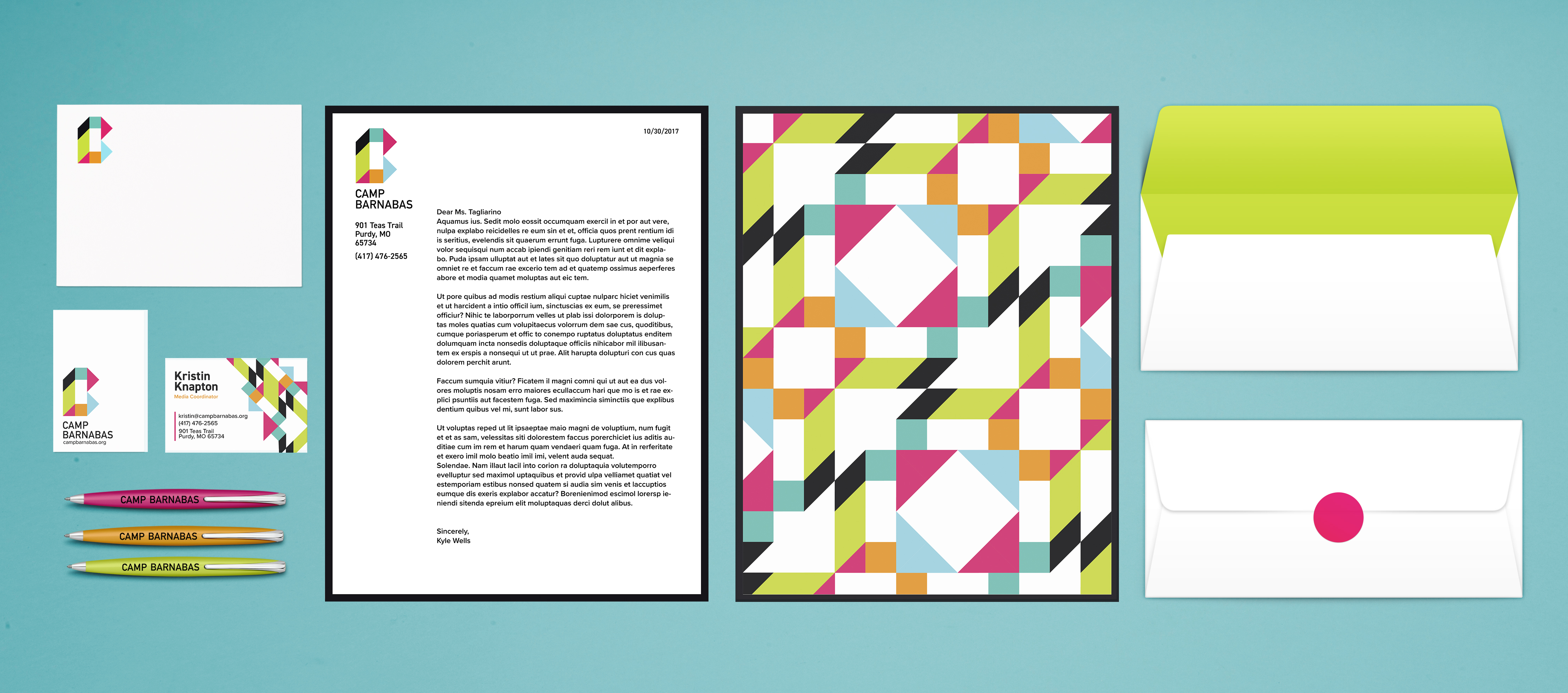
Two sans-serif typefaces were chosen for the brand. Din presents a clean image that reassures the viewer of Camp Barnabas’ trustworthiness. Proxima Nova is rounder and friendlier, which draws on the fun-loving nature of a summer camp.
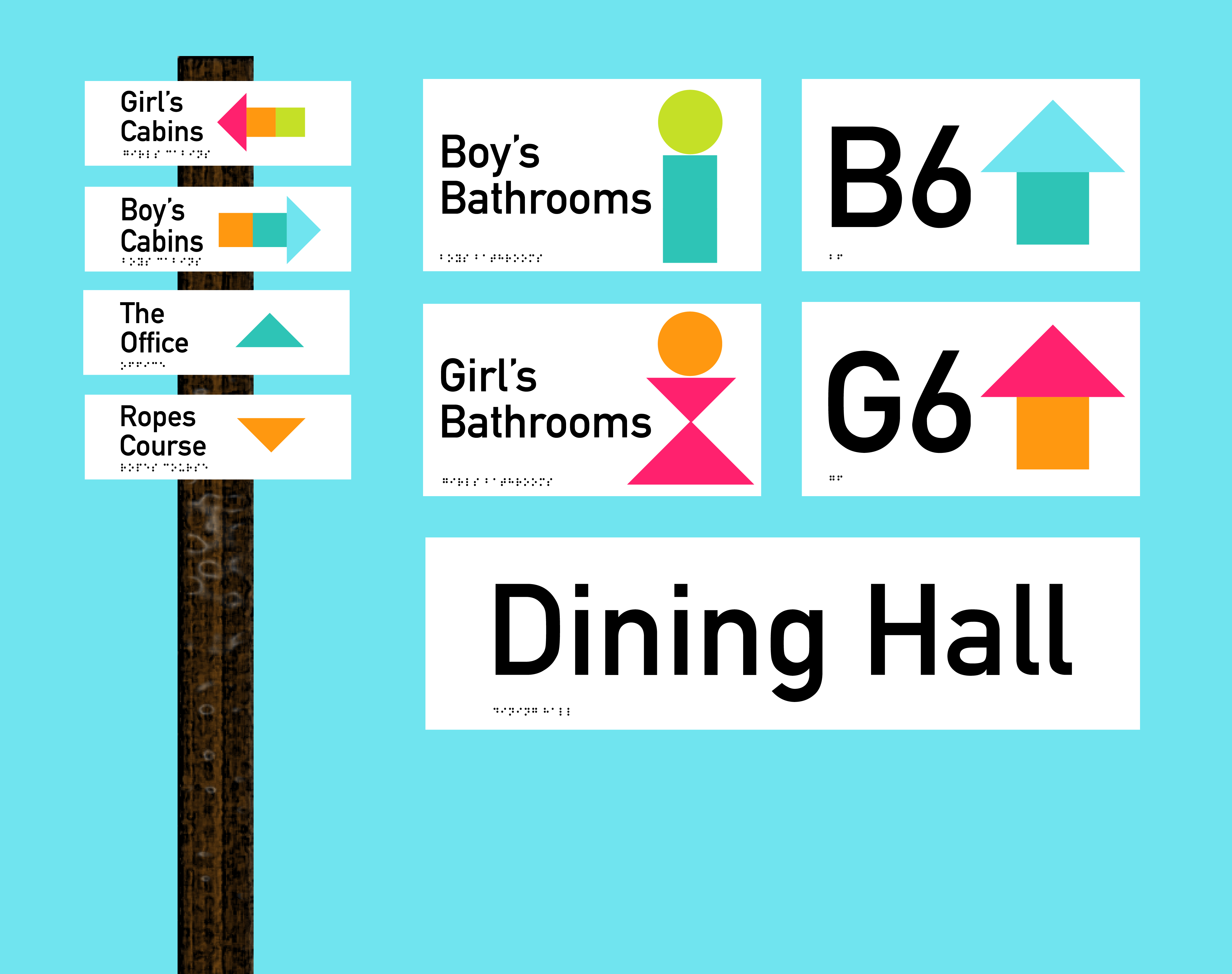
The camp’s current wayfinding system was non-existent. What little signage did exist was mostly hand-painted and weathered. The new system incorporates accessible features such as easy to read type, braille, and a straightforward color and icon system.
The branding system expands easily into uniforms and merchandise. The bright colors are recognizable from a distance and have a clean but joyous air.